


Supermarket Survey, pt. I
Supermarket Survey, pt. I
A peek into the brand designs of our favorite grocery stores

This is part one in a two part series.
I am originally from Wake Forest, NC—very close to Raleigh. When I was growing up we had a Food Lion and a Winn-Dixie nearby. Now there are nearly ten grocery stores within a two mile diameter of Wake Forest. It’s turning into a supermarket sprawl.
Let’s browse the aisles of grocery stores—from logos, color systems, typography, brand positioning and any relevant brand messaging.

Part II will include Albertsons, Aldi, Wegmans, Safeway, Harris Teeter, and Lowes Foods. I’m not including Walmart, Sam’s Club, Costco, and Target. Walmart probably sells a ton of groceries but this is intended to focus on grocery-exclusive supermarkets. I’m also not getting hyper local to H-E-B, Piggly Wiggly, BI-LO, Ingles, and ShopRite. We all have our limits.
Food Lion
Food Lion was established 1957 in Salisbury, NC. It existed originally as “Food Town” and was purchased by a German holding company, Delhaize Group (est. 1867) and subsequently renamed to Food Lion.

It was in 1983 that Food Lion assumed the logo of Delhaize Group and refreshed their Food Town brand. This introduced the lion into the logo. Unfortunately, somehow the official brand logo of Food Lion looks like a bad tracing of the parent Delhaize lion.

And it is an officially bad version—the poorly traced lion is on the storefront of Food Lion grocery stores. How does this happen? Who is in charge?

Food Lion is quite a hold out in terms of updating or distinguishing their brand. There is a generically safe blue that is their keystone color but little other supports or contrasts in terms of overall palette. There is a wild blend of typography from Futura, to Arial, to what looks like an intentional use of Hoefler & Co.’s Whitney. Unfortunately the fonts are all muddled and used interchangeably rather than dedicated to the brand.
In 2014, they unveiled a new tagline, “Easy, Fresh and Affordable...You Can Count on Food Lion Every Day.” This basically sums up the brand: nothing special but a generic supermarket with inexpensive options (quotidian).
Kroger

Kroger opened its doors in Cincinnati, OH, in 1883. Cincinnati, OH. It is now the largest grocery chain in North America.
Kroger bought Harris Teeter in 2013. Kroger is in active talks to merge and acquire Albertsons (initiated on October 14, 2022).

First things first, here is a link to their 2019 rebrand as covered by Under Consideration’s Brand New. And another article by Nice Branding Agency with their input. These are comprehensive but I’ll add some flavor.
Kroger is only supermarket with a distinct illustration style: the customizable and dynamic, Krojis. Brand New covered a breakdown in their article, In Defense of the Krojis with plenty of supporting images and a great opinion. The possibilities with these folks is limitless when it comes to marketing and brand awareness.

As far as color, there is not much beyond the core blue—which is a bit boring. A rainbow of other colors is teased and tested (see the Kroji illustration) but restrained elsewhere.
Much like the boring blue, brand typography is composed of two geometric sans serifs: Gotham Round and ITC Avant Garde. Both seem to be interchangeable between headline and subhead but neither seem to really carry the flag.
“Fresh for everyone” is the tagline and a pretty good one at that. It’s short, sweet, and inclusive.
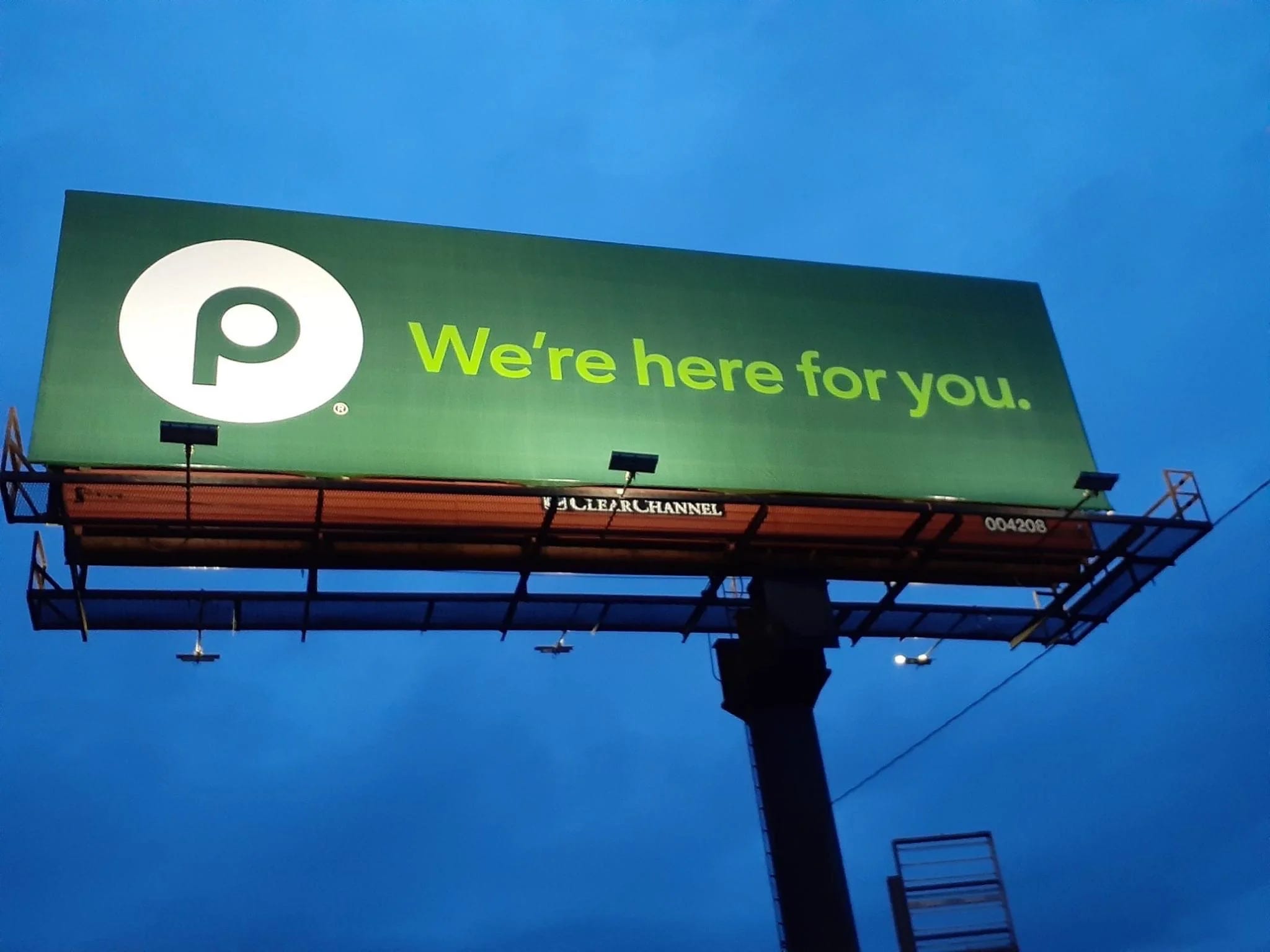
Publix

Publix started in 1930 in Winter Haven, FL.
To kick off, here’s an interesting story on the brand’s name: George Jenkins, the founder of Publix, came across a struggling New York-based movie theater company called Publix Theatres Corporation. “Most of the theaters were closing up, and I liked the sound of the name, so I just took it for my store.” [Source.] What a lazy and brilliant idea.
Publix uses a very Avenir-style font called Mr George. This is a custom font (no design credit found) named after the aforementioned founder, George Jenkins. This font is used exclusively: in-store, billboards, and on their website. I absolutely love seeing custom typography and this is a great example.
Paired with their green spectrum of two or three key greens, the brand feels complete. The green is intentional and simply different from the landscape of other supermarkets (along with Lowes Foods and Whole Foods).
It looks like they’ve completely dropped the name from their logo (except on storefronts and in occasional merchandise) and lean toward just using the circular “P” logo as their primary identifier.
Like all major supermarkets, Publix stocks a store-brand selection of generic products. The art direction and creativity can’t go unmentioned. It’s not winning awards but the brand is apparent at the quality is palpable.

The Publix tagline, “Where shopping is a pleasure,” looks like it’s been in use since the beginning. Its a great tagline that reflects the overall Publix experience. This taglines speaks less to price and pathos and much more to the visceral and ethological experience. (Kroger may be cheaper but at Publix the floors are clean, the food is stocked, and the people are nice.)

Publix is also one of the only supermarkets with a mascot. Since 1991, Plato the Publixaurus has been the mascot for Publix. I highly recommend browsing the history in this blog post on the Publix website.


Trader Joe’s
Trader Joe’s was started in Pasadena, CA (in 1958 as Pronto Markets, in 1967 as Trader Joe’s) by a real joe, Joe Coulombe.
The current Trader Joe’s visual aesthetic pulls inspiration from Trader Vic’s, a famous Hawaiian/tiki-themed restaurant in nearby Los Angeles. It’s kind of wild how blatant the influence is as Trader Joe’s continues to grow as a major corporation but its roots are in this wacky, tacky appropriated style.


This is the definition of a wonky logo. The disparity in stem thickness of the T and R; the line weights of the E; the curves of the S. Nothing about it is technically good.
There really isn’t much to speak of in terms of cohesive core assets. They have a logo, yes. But as far as typography and color system across packaging there is no singular voice. The vernacular and flavors of the food write the art direction.

Trader Joe’s was featured on the podcast, Freakonomics (episode 359), “Should America be run by… Trader Joe’s?”. The summary states that “Trader Joe’s has a lot to teach all of us about choice architecture, efficiency, frugality, collaboration, and team spirit”—and that sales per square foot are as much as three or four times competitors. Seriously, listen to the podcast.

Whole Foods Market
Whole Foods Market (henceforth, simply Whole Foods) was established in 1980 in Austin, TX. Once more with a podcast reference. This time its Whole Foods Market: John Mackey (2017) on How I Built This, hosted by Guy Raz. My opinion isn’t influenced by that episode as much as I share it for context on the company story.

Whole Foods is perhaps the most “corporate” of supermarkets—even before its acquisition by Amazon in 2017. The company seems to have always adhered to its own brand guidelines and unique art direction in food photography. Designer Laura Peters worked at Whole Foods and showcases some of the work on her site.
Corda (Hoftype) and Circular (Lineto) are the core type families in the identity system. Colors are listed on the website’s CSS; a few listed are: mushroom gray, squid ink black, and kale green (the official color of the logo). I’m a sucker for named colors beyond simply green, gray, and black.

The logo has changed a bit over the years. The image above splits the newest on the bottom and an over version on the top. Letters to note: the leaf on the O; serifs on the crossbar of the E and F; and a slightly less exaggerated R (at the cap height).
It’s probably obvious that the price point at Whole Foods is the highest among competitors. They lean into the organic and health-centric offering and price accordingly. Their missions is, “Our purpose is to nourish people and the planet.” Its less about value-shopping, or saving money, or enjoying your experience rather, what impact your patronage has on the planet.
Lidl
Lidl, Lidl, Lidl.
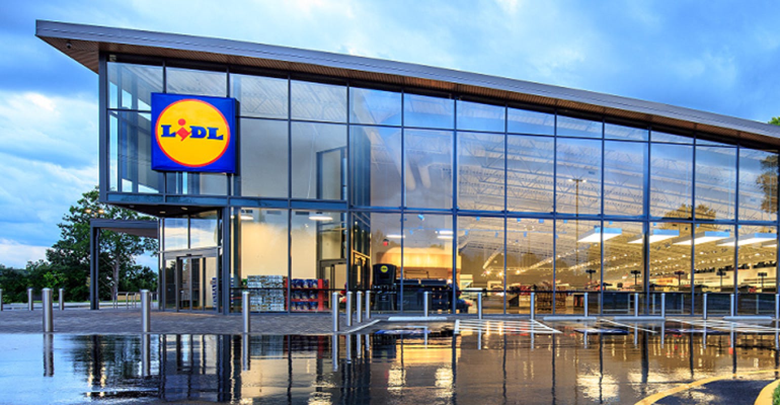
This is our first stop around the supermarket circuit that I haven’t personally visited. It also our first stop with initial roots outside the United States (aside from Delhaize Group of Germany operating Food Lion). Established in 1932 and headquartered in Neckarsulm, Germany, Lidl operates primary in the EU but dipping its toes into the discount, “no frills” approach.

Even with its gaudy yellow and blue, there is cohesion in visual language. A custom corporate font (Lidl Font Pro, as designed by Supertype). Lidl gives me the impression of IKEA for groceries. This is both reinforced in their discount approach and their logo. The logo is blue and yellow with that pop of red all sitting inside a circular container.
Formerly “Big on quality. Lidl on price,” now Lidl is leaning into “Suspiciously low-priced groceries.” I’ve seen some of the marketing and its not too bad. As usual, the messaging focuses on price (rather than quality or impact).
Architecturally, Lidl has a unique take on the slightly cantilevered roof and glass walls. Most grocery store facades are purely brick and only differentiate in their masthead logo above the front door. Lidl doesn’t seem to enter old spaces but only new construction—and here they can brand the space uniformly.
To be continued…
That’s it for now. This is part one of a two part series. The next half publishes next week.